Circle Sans: We have the technology
In 2019 we got a rebrand at Coffee Circle, and with it two new typefaces: Noe Display for the headlines, FF Mark Pro for everything else. A beautiful pairing. A while later we learned that half of it, legally speaking, wasn't entirely ours.
The licensing had gone wrong. Noe was fine. Mark Pro was licensed for print and desktop seats, but not for the web. A webshop, as it turns out, mostly happens on the web. Monotype had taken over the licensing business by then, and they noticed before we did. We paid a penalty fee. To be fair to them, we got a good deal on top: the licence stayed valid for two more years. A good deal with a strict countdown attached.
So the search began for a typeface with the one property Mark Pro never had: a licence nobody can get wrong. One of our devs found Albert Sans. A geometric sans by the Danish type designer Andreas Rasmussen, published under the SIL Open Font License. Free to use, free to embed, free to modify. It looked like the perfect fit, and we switched.
#Another task for the icebox
The switch left a little list behind. The kind of list that survives every planning round by being nobody's actual job:
Nobody liked the uppercase Q. Its tail is a centred vertical bar through the bowl. Once a colleague said "Quake logo" out loud, it could never be unseen again. And it had a second problem: a circle with a stem out at the bottom kinda mimics our own drip wordmark. Close enough to look related, off enough to look wrong.
A coffee company needs an ff. Kaffee, Koffein, Coffee. The words we set in headlines every single day carry a double f, and Albert Sans draws an fi but no ff. Two crossbars crashing into each other, at display sizes, on the front page.
And two OpenType alternates wanted freezing. We always turn on the long-stem g and the open ampersand anyway.
font-feature-settingscarries that fine, right up until the text lands in an email template, a PDF export, an external designer or an app that has never heard of the property.
None of this is hard in a font editor, for one font. Albert Sans is a variable font: nine weights, two widths, roman and italic, interpolated from twelve masters. Every change has to be drawn twelve times, in perfect sync, or the interpolation tears. The tooling around that has not been great. We tried, we failed, and the list went into the icebox and froze solid. For years.
Why put up with a variable font at all, then? Because it earns its keep everywhere else. One file carries the whole family: every weight from Thin to Black, both widths, and everything in between. The webshop loads a single woff2 instead of a stack of static cuts. The design system stops asking whether 600 or 700 is closer to what we mean and just picks 640.
Every change has to be drawn twelve times, in perfect sync, or the interpolation tears.
#We might have the technology
This month, a meeting dug up the icebox again. Same list, same sigh. But something had changed since we failed at it: we might have the technology now. The same evening I opened Claude Code and started what the licence had allowed all along: a proper fork. The OFL explicitly permits modifying and redistributing a font, as long as the result carries a new name. So that's what happened. New name, public repo, Andreas Rasmussen's designer credit untouched. Circle Sans.
What I did not expect is how well an agent and font sources get along. Font sources are text files. The agent writes a script, the script edits all twelve masters at once, the build compiles, and a rendered proof comes back for me to look at. I only drafted two quick versions, regular and bold, after that my part shrank to two verbs: describe and decide.
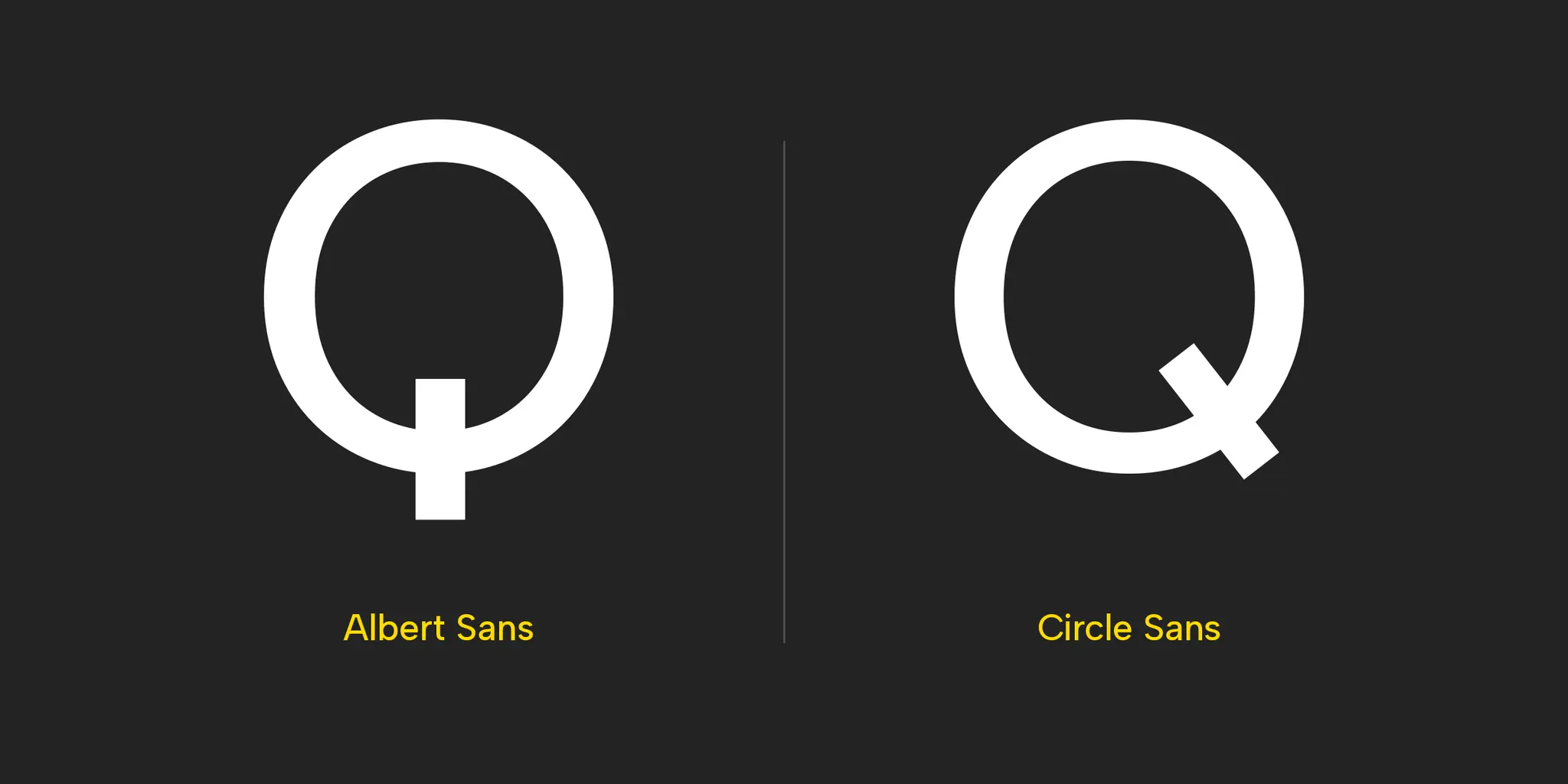
The Q got a diagonal stroke crossing the bowl at the lower right, replacing the vertical bar. The angle is a fixed −52° in every weight and width. A tail that slowly rotates as the weight changes is exactly the kind of drift you get when twelve masters are edited by hand and nobody measures.
The g and the ampersand were frozen the polite way: the alternate outlines swapped places with the defaults, and the kerning travelled along. The stylistic sets still work, they just return the original shapes now. ss02 gives you the short-stem g back, ss04 the closed ampersand. Nothing was deleted.
The ligature was the part I actually cared about. The original font even kerns f+f a bunch of units apart to soften the crossbar clash. That is the typographic equivalent of moving two arguing kids to opposite ends of the table. The agent drew four candidate ligatures instead and rendered them side by side as specimens. I rejected three and the winner follows the fi's own logic: first arm trimmed exactly the way the fi trims it, one fused crossbar, the second stem planted where the fi plants its dotted stem. I didn't draw four ligatures. I judged four and kept one that fitted the font perfectly.
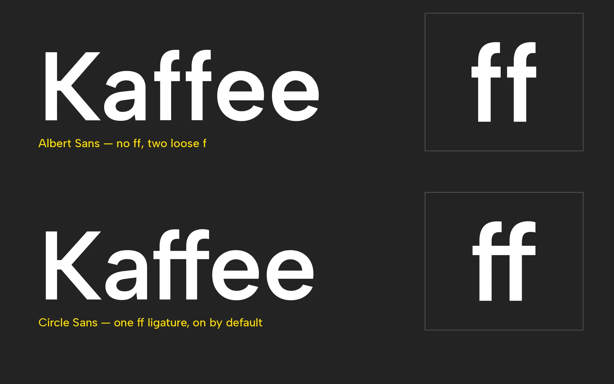
One trap for anyone trying this at home: WebKit drops ligatures on letter-spaced text, and no CSS declaration brings them back. A tracked hero headline will show two loose f in Safari, forever. Our specimen's display styles lost their letter-spacing for exactly this reason.
I didn't draw four ligatures. I judged four and kept one.
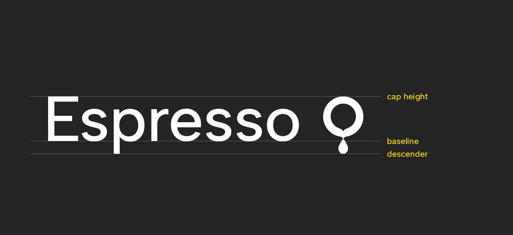
And since the sources were open anyway, one addition that was never on the icebox list: the Coffee Circle drip is now a glyph. Type [drip] and the font resolves it to the mark. It also sits at U+E000 if you prefer typing like a machine. It behaves like a descending letter: drip tip resting on the descender, ring meeting cap height. It takes currentColor and scales with font-size. No SVG to place, nothing to recolour. Drawn once, identical in all twelve masters. More of an easter egg than an actual feature, but it just felt right.
#The switch is a breeze if the foundation is good
The whole family lives on a fancy specimen page: nine weights, two widths, roman and italic. FontBakery checks run on every build, and font versions are stamped from a manually added release tags.
How tedious is the switch itself? My design system in Figma keeps the font family name saved as a variable. Swapping a brand typeface is editing one value. Every component, every mockup, done. The site is one @font-face block. Colleagues get a small installer app that fetches the newest release and sets aside whatever Circle Sans was already installed. What a breeze.
While poking at the font files we also solved a small mystery. The live site still serves Albert Sans 1.25, while Figma pulls 1.31 from Google Fonts. We actually respaced and re-kerned nearly everything between those releases. A tight pair like the 9, in a price is nearly 20% narrower in 1.31. My designs and the live site have been disagreeing about spacing for two years, and both were right but never took the time to pin it down on the font version. Circle Sans is built from 1.31, so the swap ends that argument too.
Rungeto, riding the weight axis.
Six years after the rebrand, the typeface story ends where it started: with licensing. Except this time the licence is the boring part. OFL in, OFL out, the fork is public, and nobody can send us an invoice.
And credit where it belongs: Circle Sans is still Andreas Rasmussen's typeface. He drew a complete, well-rounded family and released it under a licence generous enough to allow everything this post describes. Thank you, Andreas. We redrew one tail, froze two defaults, added a ligature and hid a drip in it. The other five hundred glyphs are his, and they carry our brand every day ☕