Is this the best Förderverein website?
Förderverein has no good English word. Booster club, PTA, Friends of the School — all close, none right. So I'll keep the German one: a registered nonprofit with a board, bylaws, an annual meeting and a bank account, run entirely by volunteers, whose whole job is to buy the things the school's budget doesn't stretch to. Class trip money for families who can't afford it. A 3D printer. An e-bike for the nature club and more like that.
All of it funded by donations and membership fees. So a Förderverein lives or dies on two things: whether anyone knows it exists, and whether people trust it enough to give it money every year. Both are solved the same way — by being visible about what you decide and where the money goes.
Nearly every school in Germany has one. Almost none of them have a website worth visiting.
Why I did this at all
I wanted to learn two things: how to work with AI properly, and how to build with Kirby CMS. The usual way to learn that is to build a demo project, get bored halfway, and never finish it.
So instead I looked for someone who actually needed the result. A Förderverein was the obvious answer. They have no budget, no technical people, and a website that is usually a subpage of the school site with a scanned PDF form on it. The bar is on the floor, the need is real, and nobody loses anything if the experiment goes sideways.
It worked out well for both sides. I got a real project with real constraints instead of a sandbox, and the association got something they could never have paid for. They've been very grateful, which is a nicer feedback loop than a finished tutorial.
This is a walkthrough of what i built for the Förderverein der Realschule Bad Bentheim e.V., plus an honest check on whether the title of this post is defensible or just clickbait.
The problem we were escaping
Previously the Förderverein had a subpage on the School-website, with a membership form as a downloadable PDF. The PDF was last updated in 2011. You are supposed to print it, sign it, and give it to your child to hand to a teacher.
This is not a technology problem, it's a framing problem. That kind of site treats joining as paperwork you fill out because you already decided. But nobody has already decided. The decision and the paperwork happen in the same moment, and if the paperwork needs a printer, the decision is "no".
So the whole build started from one idea: the site's job is to turn a stranger into a small supporter in under two minutes. Everything else comes second.
Tone of Voice: being honest works better than being polite.
A pretty unusual thing about the site is the tone. German legal and association communication is normally quite stiff. Sehr geehrte Damen und Herren, passive voice, the feeling that you are writing to a government office.
We did the opposite. The print material says it directly: "Wir brauchen dein Geld." We need your money.
And then it immediately says what we don't need:
Baking cakes: voluntary
Annual meeting: not mandatory
Supporting the students: from 12 € a year
That order is the best decision in the whole project. The real objection to joining a Förderverein isn't the money. 12 € a year is nothing. It's the fear of being volunteered. Of ending up in a WhatsApp group about the Christmas market. Naming that fear and removing it before you ask for anything costs nothing and removes the actual barrier.
Membership: the tier is the game
Yes, you can absolutely be a Starter for 12 € a year, and that is genuinely fine. But do you want to be the Starter? Or would Macher feel better? Your choice. 😉
The signup does everything on one page. Name, address, connection to the school, tier, SEPA direct debit mandate, done.
The tiers have names, not numbers, and that's the whole point:
Starter — 12 € a year, nur 1,00 € / Monat
Macher — 24 € a year, nur 2,00 € / Monat
Vorbild — 36 € a year, nur 3,00 € / Monat
Visionär — your own amount
It's a small piece of gamification and it does more work than the price difference suggests. Nobody upgrades because 24 € is better value than 12 €. They upgrade because "Macher" is a nicer thing to be than "Starter". The naming does the persuading, so the copy doesn't have to.
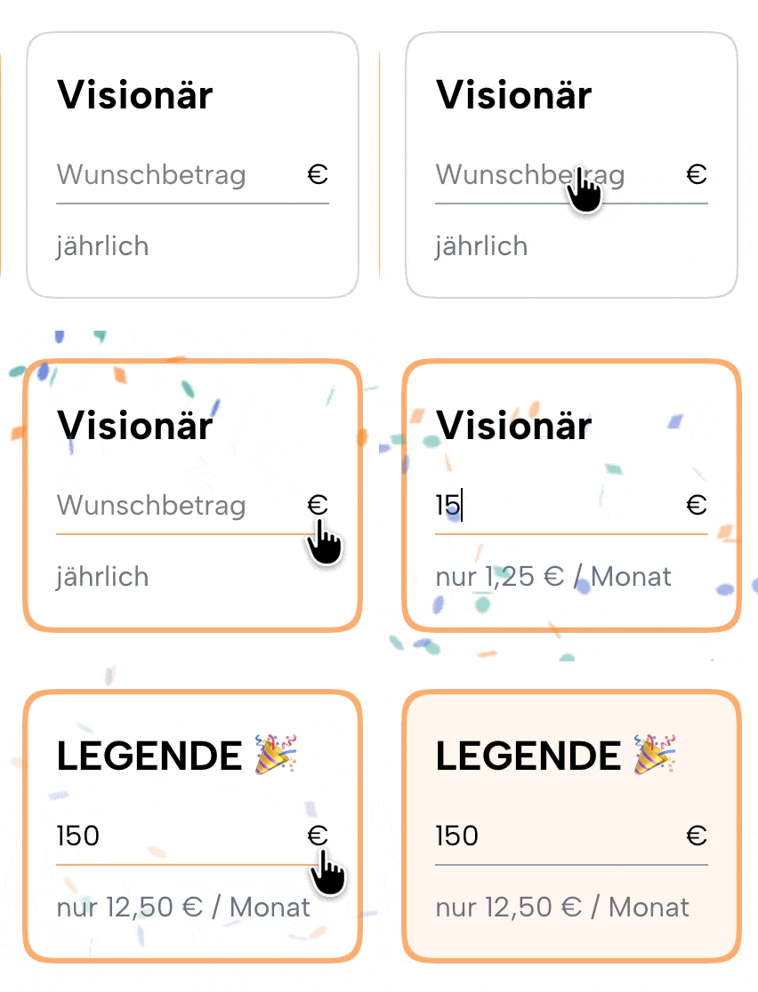
Under every tier there's the monthly version of the number. 36 € a year is a decision. 3 € a month is a rounding error. Same money, completely different feeling. This feeling is intensified by a bigger burst of confetti when you click the button. Your choice, but we nudge you into the right direction.
The SEPA mandate is part of the same form, in plain German, with the creditor ID right there in the consent text. No second step, no "we will send you the documents". The mandate is the signup. That's where most association sites fail: they collect interest and then need a manual second step to actually start the money, and everyone falls out in between. Although there are some legal restrictions to a SEPA mandate, the benefits outweigh the drawbacks in every respect.
Behind the panel: the boring part that matters most
Membership submissions land in a clean members section in the Kirby panel. Not a mail dump, not a spreadsheet on someone's laptop — a proper section the board can log into and work with.
It does a few things that make a real difference for volunteers:
CSV export, so the treasurer can get the data into whatever the bank or the accounting person needs, without me being involved.
Careful handling of personal data. Member records include names, addresses and bank details, so the personal fields are encoded properly rather than sitting there in plain text. A volunteer association is exactly the kind of place where this gets ignored, and exactly the kind of place where it shouldn't be.
KPIs on the dashboard. Average contribution, total yearly amount, how many members joined since a given date, and so on.
The KPI part started as a nice-to-have and turned out to be one of the most used features. A Förderverein board has to stand up at the annual meeting and say something about how the year went. Before, that meant somebody counting rows in Excel the evening before. Now the numbers are just there, always current, and the reporting stops being a task.
There's also a continuity argument. A board is three to six volunteers with day jobs. If the member list lives in one person's spreadsheet, the association is one resignation away from a problem. Putting it in the CMS means nothing depends on anyone's laptop.
Das Wunschglas: power to the people and full transparency
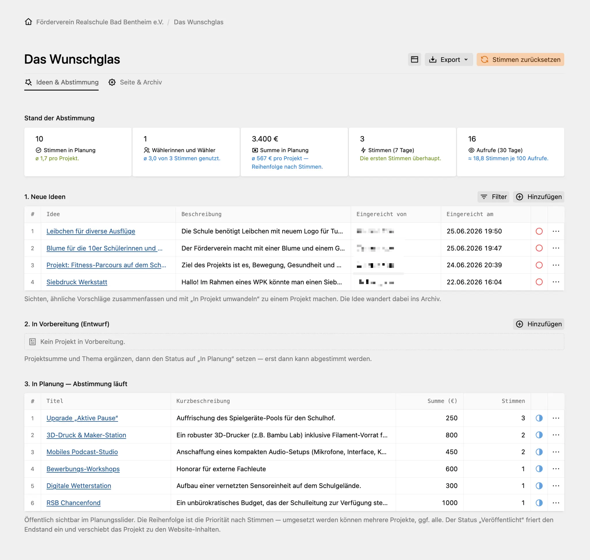
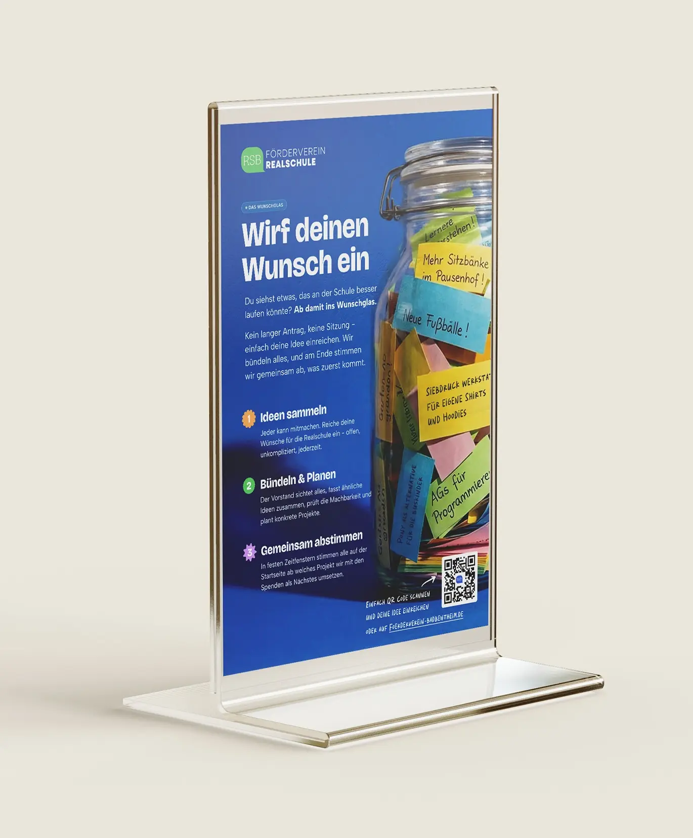
This is the feature I'm most happy with, and it has nothing to do with collecting money. Nathalie, one of our Advisory Board members, had a great idea to create a Jar on the table, where People could add their wishes and ideas. But why not also give that a digital version? So the idea made it into the Website the same day and has been very much improved since then.
Das Wunschglas ("the wish jar") is a loop with three steps:
Collect. Anyone — parent, teacher, student — submits an idea. Title, description, optional name, optional example link. That's the whole form. No account, no committee language.
Bundle and plan. The board goes through the submissions roughly once a quarter, merges similar ideas into one project, checks if it's realistic, and puts a budget on it.
Vote. Approved projects appear on the homepage with their estimated cost. Everyone can vote, and you get three votes.
The projects in the jar change all the time, which is the point, so I won't list them here. What matters are the two design decisions.
Every project shows its price. That quietly teaches the thing Fördervereine are historically bad at explaining: the gap between what a school wants and what a school has isn't abstract. It's a number, and it's usually a small one. Seeing 300 € next to a weather station makes it obvious how close most of these things are to being possible.
We could just decide this ourselves. That's the honest part. We could just look at the list and pick what's most needed, and for small things that's exactly what happens. But if a project only exists because someone in the school community wanted it, it seems strange to then set the order without asking them. So we don't. The vote is open to everyone, no login, currently three votes each, and it tells us what people actually care about most rather than what we assume they do. It's a priority vote, not a mandate — the board still has one filter it can't skip: the money has to benefit the students. Not the building, not a teacher's wish list, not the school as an institution. But within that, the order is genuinely up for discussion.
For an organisation whose main problem is that nobody knows it exists, being visibly open to input is worth more than an accurate vote count.
Direktspende: the way out for people who don't want to join
Not everyone wants to become a member of something. So there's a donation form on the homepage with no membership attached — 10, 50, 100 € or your own amount, plus name and email.
The form deliberately doesn't process payments. It registers the intention and the board follows up. Fewer moving parts, no payment provider taking a cut from a nonprofit, and nothing sensitive to secure. At this size that's the right trade-off.
Don’t forget to add some fun 🎉
A website for a school association has no reason to feel like a form. So there's a layer of small things on top:
Confetti when something good happens and a click spark, same as the click effect here. Joining should feel like something happened, not like a receipt printed.
Animations everywhere, but small ones. Buttons have a feel and effects. The arrow in a button slides right on hover. Nothing that blocks you, just constant small signs that the thing is alive.
Video instead of a hero image. The homepage opens with a moving scene rather than a static photo, and there's a short looping clip on the "welcome, you're a member now" screen.
A colour that changes. The logo mark picks one of the five brand colours randomly on every page load. Same identity, slightly different mood each visit.
None of this is necessary. All of it makes the difference between a site people close and a site people scroll. The little person in the bottom right smiles at you when you become a member. Selling a story and a familiar feeling, not just gathering your money.
Illustrations, logo scribbles and voxel videos
Three parts of the visual language are worth pulling out.
The illustrations are loosely drawn figures from the Transhumans set, laid over the coloured sections so they take on the background colour instead of sitting on top of it. They keep the pages from feeling like a corporate template without needing photography.
The logo scribbles are hand-drawn versions of the logo mark, generated as SVG in more than 35 variants — different fills, different line styles, clean marks and overlapping ones. A school association's logo should be allowed to look like a kid drew it, at least sometimes. Having a whole set of them means the brand can be loose in some places and tight in others without falling apart. They are not being used much yet, but will be spread sparsely on instagram and others in the future.
The voxel videos are short clips of everyday school life in a Minecraft-like style. Muted, autoplay, looping, used behind hero areas, in social posts or as a section accent. Never with sound and never as the only place information lives. They're the moving version of the same idea as the hero image, which brings me to the actual interesting bit.
The elephant in the room: Usage of AI
The hero image and these videos are a voxel, Minecraft-like rendering of the school. Not a generic school — this school. The brick façade, the flat-roofed wing with the white pergola, the outside staircase, the notice board next to the door, the benches along the wall, the table tennis tables, the big tree in the middle of the yard. Blocky green trees. Minifigure-sized students eating lunch at the picnic tables.
There are two reasons this is more than just a style choice.
It solves a real legal problem. Photographing minors in Germany means written consent per child. Permissions expire, kids leave, one parent says no and the photo is unusable. So school association websites end up either using stock photos of models who look nothing like the actual students, or photos of the empty building. Both feel dead. A voxel scene has no identifiable person in it, needs no consent from anyone, and still feels full and warm. It's both easier and more honest than the photo it replaces.
The style is the audience's own language. Minecraft is the visual mother tongue of the 10 to 16 year olds this money is for. Building their school in that style isn't talking down to them, it's translating. It has since grown into a small cast of voxel students and teachers — always shown as full figures, never cropped at the face.
Every kid at that school recognises it in about a second. That's the whole trick.
The workflow is not glamorous: reference photos of the real building, an image model, a lot of prompt iterations until the specific details survive, then manual cleanup. The AI isn't being creative here. It's doing a slow stylistic transformation over and over, which would otherwise cost a 3D artist several days per scene. That's where this technology is clearly good right now: not "give me an idea", but "render this specific known thing in this specific style, cheaply, again and again".
And this wasn't some high-tech pipeline with Higgsfield and Seedance. Just a Gemini Pro prompt and one source photo of the schoolyard. It's hit or miss, and mostly miss: people float, students vanish halfway through a shot, the voices come out strange, and the model really wants to give you an American high school at all costs.
I'll admit the tension. There's something slightly odd about a school association using AI imagery while schools are still working out what to tell students about it. I don't have a clean answer to that. What I do know is that the alternative was stock photos or nothing — and stock photography has very little that looks like a German school, let alone one in a town the size of Bad Bentheim.
So, is it the best Förderverein Website?
Haha, probably not. It's just a punchy headline 😅
What it might be is the best argument: proof that a school association website can be a product instead of a noticeboard. That the ask can be direct. That the paperwork can be the signup. That the community can vote on where the money goes. That the visuals can be something the students would actually pick themselves.
And I got what I came for. I know Kirby now, and I have a much clearer idea of what AI is actually useful for and wether it will replace my job anytime soon. Learning by building something someone needs beats learning by building a demo, every time.
I still don't have an English word for Förderverein. But I do have a working theory about what one should look like on the internet: say what people don't have to do before you say what you want, put a price on everything, and let the people whose school it actually is — students and teachers above all — decide what comes first.
Steal it. It's a school association website, not a trade secret ✌️